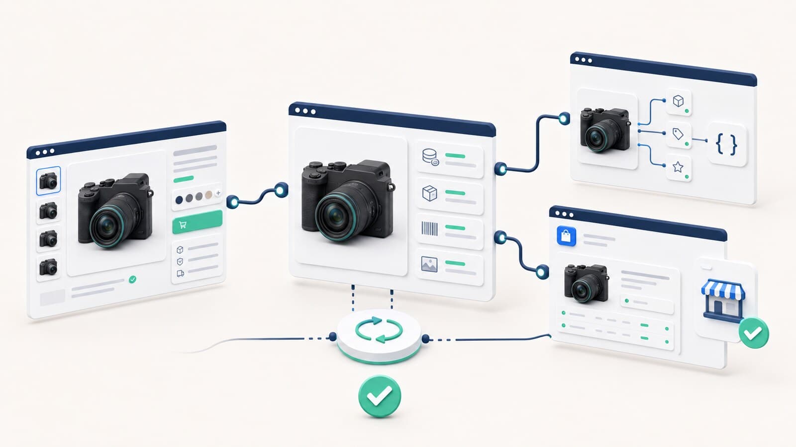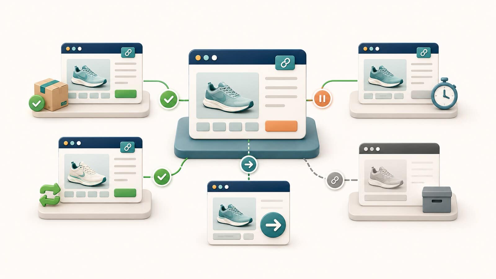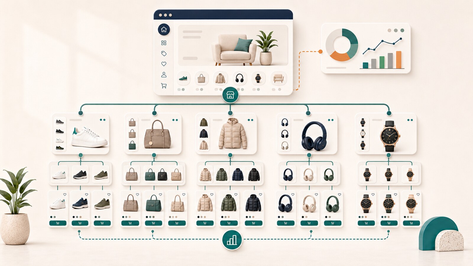
A customer visits your website, sees a general "Services" menu, and does not know where to go next. Another visitor finds a product through Google but cannot reach the right category. A third compares two solutions without seeing a clear difference between their pages. In each case, the problem is not only the design. The problem is the website structure.
Website structure is the way pages are grouped and organized around the tasks visitors need to complete. It defines the main sections, how people find services and products through the navigation, and how each page connects to a broader topic.
A clear structure helps a customer answer three questions quickly:
For a business, this means less confusion, a clearer presentation of its offerings, and a website that is easier to expand. For Google, logical organization provides additional context about how pages relate to one another. Google states that organizing a site logically can help both users and search engines understand how pages relate to the rest of the site.

Four related elements are often treated as if they were the same:
| Element | What it determines | Simple example |
|---|---|---|
| Website structure | How pages are grouped | Services > SEO > SEO Audit |
| Navigation | Which paths visitors can see | Primary menu, section menu, footer |
| Internal links | How visitors move to related information | An article links to a relevant service |
| URL | The permanent address of a page | /seo-audit/ |
The menu is not a complete map of the website. Not every page needs to appear in it. Moving a page to a different menu section also does not automatically mean its URL should change.
Detailed planning for internal links, anchor text, and pages with no incoming paths belongs to a separate internal linking review. The focus here is where each page belongs and what role it serves.

A confusing structure rarely appears as one obvious error. More often, it creates a series of small obstacles:
These problems can lead to missed inquiries and sales because visitors do not understand the offering or give up before reaching the right page. They also make maintenance harder. The team may not know where to add a new topic, which page to update, or which URLs need to remain stable.

A list of search phrases is not a finished website structure. Several different phrases can describe the same need. If a separate page is created for every variation, the site quickly fills with repetition.
A more reliable approach starts with the customer's task. For example, a person may want to:
Each important task should have one clearly recognizable page. That page can use natural synonyms without requiring a new URL for each term.
Before adding a page, answer four questions:

A clear structure begins by separating page roles. Most websites use some combination of the following page types:
Not every website needs every type. A small business site may lead directly from the homepage to a few main services. A large online store usually needs categories and subcategories, while filters, product variants, and unavailable products require separate planning.
An intermediate page makes sense only when it helps someone choose. An empty section that adds another click without useful information does not improve the structure.
The planning process can be straightforward when decisions are made in the right order.
Write down what you sell or provide, who it is for, and what action you expect a visitor to take. Do not begin with the menu. Begin with the business and the customer's tasks.
Include active services, products, categories, articles, contact pages, and utility pages. For an existing website, also include pages that already receive visits, inquiries, or external links.
Each group should contain offerings that a person would naturally look for together. Section names should describe the choice, not the company's internal organization.
When two pages serve the same task, customers may not understand the difference. The answer may be to distinguish them, combine them, or redirect one, but not to maintain two nearly identical versions without a clear reason.
There is no universal rule for an exact number of levels or clicks. Each level should help a visitor narrow the choice. If it adds no meaning, it is probably unnecessary.
Ask someone unfamiliar with the website to find a specific service, product, price, contact option, and next step. Watch where the person hesitates and which labels are unclear.
The primary menu should show the most important business areas, not every available URL. When there are many choices, they can be grouped in a dropdown or expanded menu, but the groups should remain clear and concise.
Check whether the menu:
Google explains that the additional links shown under some search results are selected automatically. Its recommendations include a logical structure, easy navigation, informative headings, and links to important pages from other relevant pages. No setting guarantees that particular sitelinks will appear.
A breadcrumb shows where a page sits, for example:
Home > Services > SEO
It helps visitors return to a broader section. Google also describes breadcrumbs as a way to show a page's position in a hierarchy and recommends that they represent a typical user path rather than mechanically copying the URL structure.
A URL should be understandable and stable. It does not need to contain every level of the menu. An excessively long address is harder to maintain, and every structural change can create unnecessary migration work.
Google recommends readable, descriptive words in URLs. For websites with thousands of URLs, grouping related pages in directories can also help Google understand how often different sections change. For a small website, this is not a reason to create artificial folders.
Do not begin with a new menu and a large batch of URL changes. First determine which pages have a clear role and real value.
Choose one action for each important URL:
| Action | When it makes sense |
|---|---|
| Keep | The page has a clear task and belongs in the right place |
| Improve | The task is right, but the content or navigation is unclear |
| Move only in the navigation | A different section is more logical, but the URL can remain |
| Combine | Two pages serve the same task |
| Redirect | The old URL has an exact replacement |
| Remove | The page has no useful role and no appropriate replacement |
When a URL changes, plan the redirect from the old address, update internal links, and verify the result after launch. That is a separate technical decision. A menu change alone does not require a URL change.
A good structure is not proven by an attractive diagram alone. Test it through visitor behavior and the condition of the website.
Useful questions include:
Analytics, site search data, Google Search Console, and a technical crawl can reveal different parts of the problem. No single source proves by itself that the structure makes sense to customers.
A small website can often be organized internally when it has few services or products, every page has a clear role, and no important URL changes are planned.
A professional review is a reasonable choice when:
As part of SEO optimization, the structure can be reviewed together with the content, navigation, internal links, and technical consequences of any changes. The goal is to help customers reach the right offering while the website keeps clear, stable URLs.
For a new project, the structure should be part of the requirements before development begins. Our WordPress web design service includes building the pages and navigation around an approved plan.