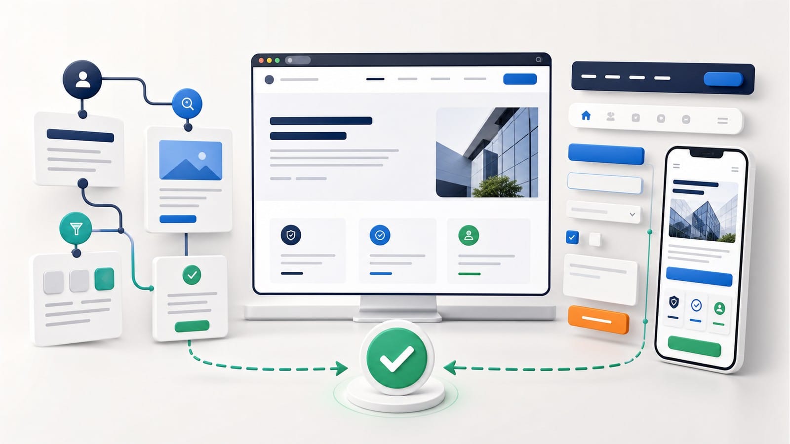
UX design helps visitors understand your offer, find the right service, and send an inquiry. UI design turns that journey into visible elements such as menus, buttons, forms, and messages. Both are part of professional web design. This guide will help you evaluate the experience on a business website, but it does not cover pricing, packages, or the technical delivery of business website development.
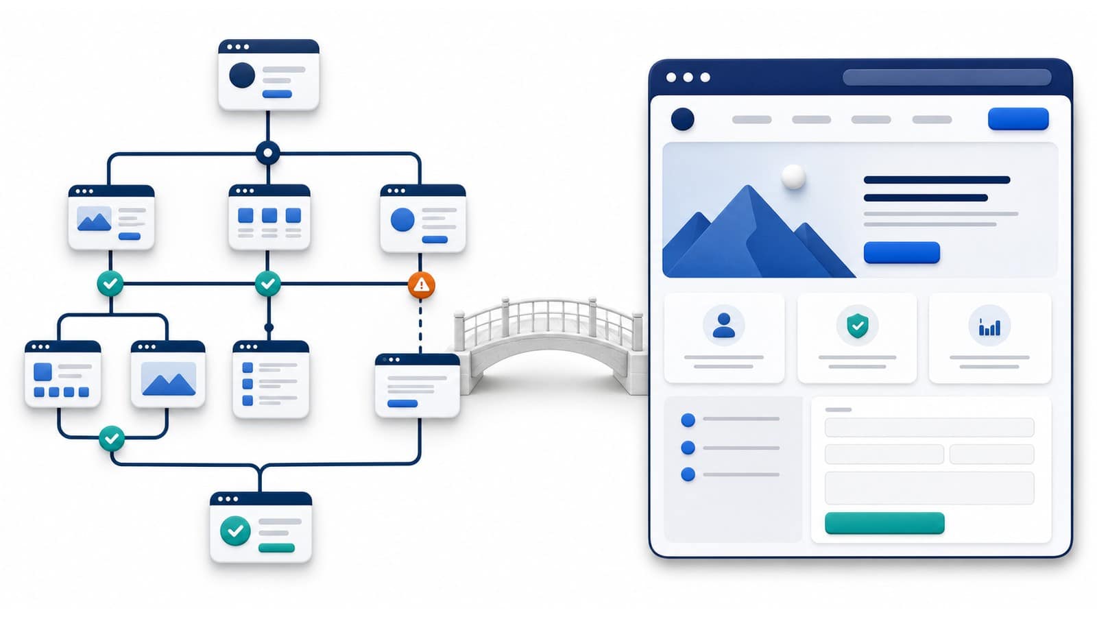
UX answers whether people can achieve their goal easily and without unnecessary confusion. UI answers whether they can see, recognize, and understand the elements they need to use. Put simply, UX defines what should happen and in what order. UI shows people how to do it on the screen.
| UX design | UI design | |
|---|---|---|
| Primary purpose | Organizes information, choices, and steps | Makes those steps visible and understandable |
| Example | A visitor finds the right service and understands how to request a quote | The inquiry button stands out and the form fields are clear |
| Typical problem | Important information is missing or the next step is not logical | An important button is easy to miss, text is hard to read, or an error is not explained |
| Main question | "Can I do what I came here to do?" | "Do I understand how to use this page?" |
Imagine a visitor who needs a new company website. If that person cannot tell which service is right, how the project works, or what they need to prepare, the problem is mainly UX. If the information is available but the link looks like ordinary text, the button is hard to notice, or the form does not show where an error occurred, the problem is mainly UI.
On a real website, both kinds of problems often overlap. That is why "make the design look more modern" is not a sufficient assignment. First, identify where people struggle. Then determine whether an important piece of information or a step is missing, whether the necessary element is not clear enough, or whether both issues are present.
UX stands for user experience. On a business website, UX design organizes content and actions around the visitor's needs, not the company's internal structure. Its purpose is to help people understand where they are, what the business offers, whether the offer is relevant to them, and what a reasonable next step would be.
A user journey starts with a specific need. For example, a small-business owner may be looking for someone to build a new website. The owner might first visit the homepage, review the relevant service, look for evidence of experience, and then send an inquiry. UX design should make that journey logical without assuming that the visitor understands the provider's terminology or internal organization.
Usability is an important part of UX. ISO 9241-11:2018 treats usability as an outcome of using a system in a specific context. This keeps the evaluation focused on real people performing a real task, rather than on a personal opinion about whether a page "looks good."
To evaluate the UX of a business website, start with straightforward questions:
Good UX does not necessarily mean a short page or fewer steps. Sometimes people need more information before they can make a decision. What matters is that every step has a purpose and that the content appears when it helps with the next choice.
UI stands for user interface. It is the visible part of the website that people use to read, choose, and take action. UI includes typefaces, colors, spacing, buttons, links, fields, icons, and the way these elements change after an action.
A well-designed interface does not make visitors guess. A link looks like a link, the primary button is distinct from secondary actions, a field has a clear label, and an error message explains what needs to be corrected. This is not only about appearance. It is about clarity in use.
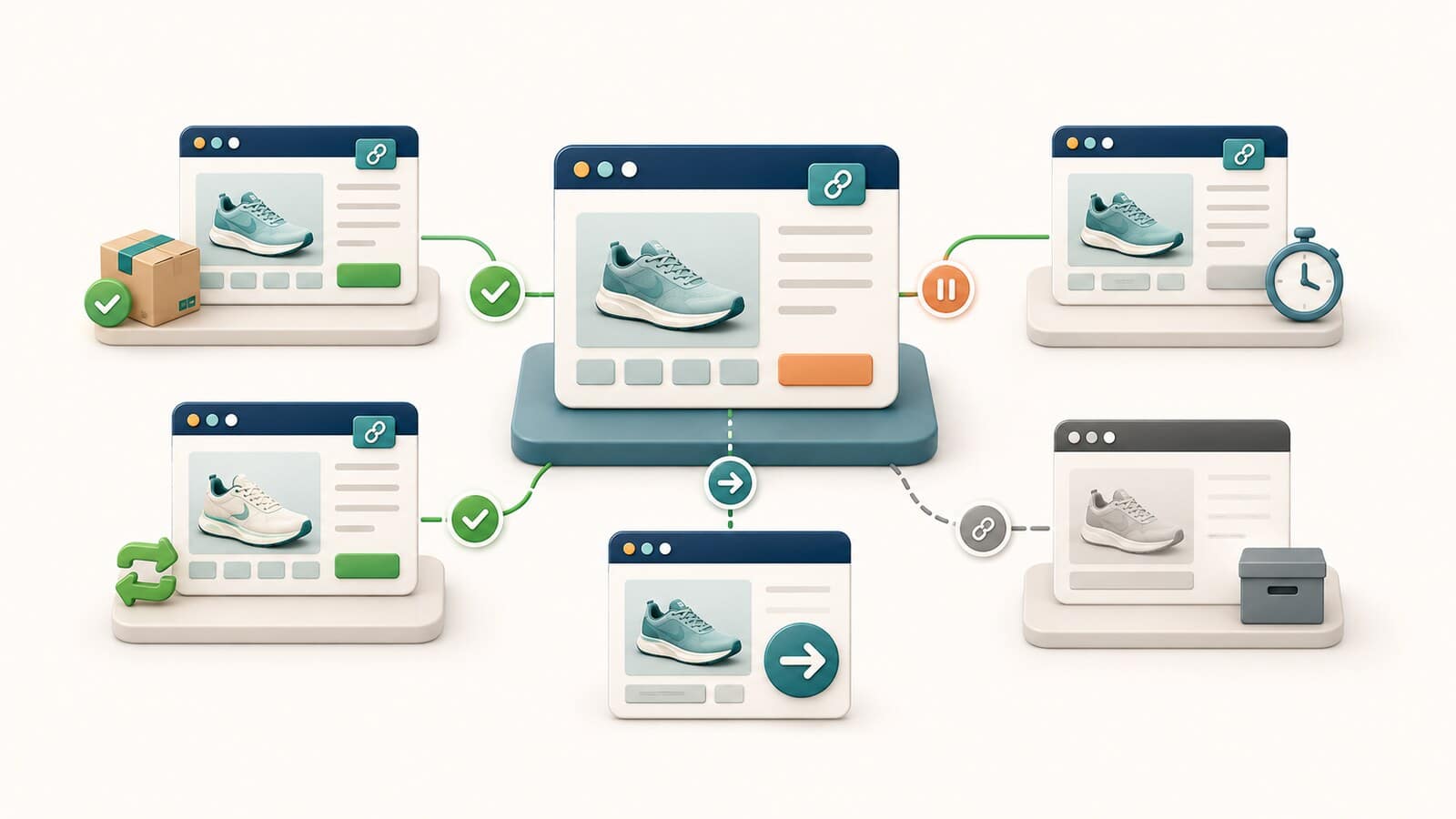
The website should clearly show what people can do and what happens after they act. A button, for example, might be ready to select, temporarily unavailable, or processing a request. A field might be empty, focused, completed correctly, or in an error state. Designers call these variations interface states. If they all look the same, visitors cannot tell whether the website accepted their action.
After every important action, the website should provide a clear response. It might confirm that a form was submitted, explain a problem, or show that the page is loading a result. This response is called feedback. The W3C tips for accessible interface design recommend making interactive elements easy to recognize, keeping navigation consistent, giving fields clear labels, and making feedback noticeable.
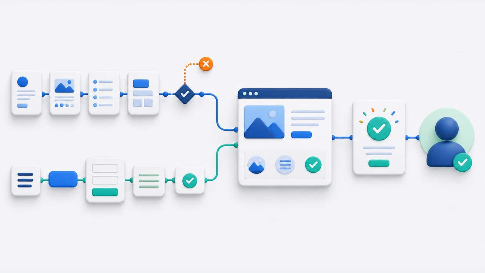
UX and UI address the same task from different directions. UX defines what the visitor needs to understand and do. UI communicates that logic through words, layout, and interactive elements. A polished interface cannot repair incomplete logic. Sound logic will still fail if the interface presents it poorly.
For an inquiry journey, the relationship works like this:
This distinction also helps when correcting a problem. If a form asks for unnecessary information, the change belongs mainly to UX. If a required field has no visible label, the change belongs mainly to UI. If the button does not submit the data, the cause may be technical and should be investigated by a developer.
Test the journeys that lead to a meaningful outcome for both the visitor and the business. It is not enough to confirm that a page opens. You need to know whether people understand the offer, find the right service, see enough reasons to trust the company, and successfully make contact. Do not tell participants where to click. The website should guide them on its own.
From the first visit to understanding the offer. Open the page as someone who does not know the company. After a brief review, that person should be able to explain in their own words what the business offers, who the service is for, and what problem it solves. If the person can repeat phrases from the page but cannot explain what they mean, the message is not yet clear enough.
From the general offer to the right service. Give the participant a realistic need, such as: "My company has an outdated website, and I want to understand my options." Watch which link the person chooses and why. Menu labels and link text should help distinguish a new website, a redesign of an existing website, and another related service without requiring knowledge of how the company has organized its work.
From interest to trust. After finding the service, visitors usually want to know whether they can rely on the company. Check whether they can easily identify who is behind the website, how the process works, how to get in touch, and what evidence supports important claims. A logo, photo, or broad promise is not enough when specific information is missing.
From the decision to a submitted inquiry. People should know how to continue, what information is expected, and what will happen after submission. Follow the full process, including an incorrectly completed field and a successful submission in a test environment. If visitors have to search for the button, guess what a field means, or wonder whether the message was sent, the journey is incomplete.
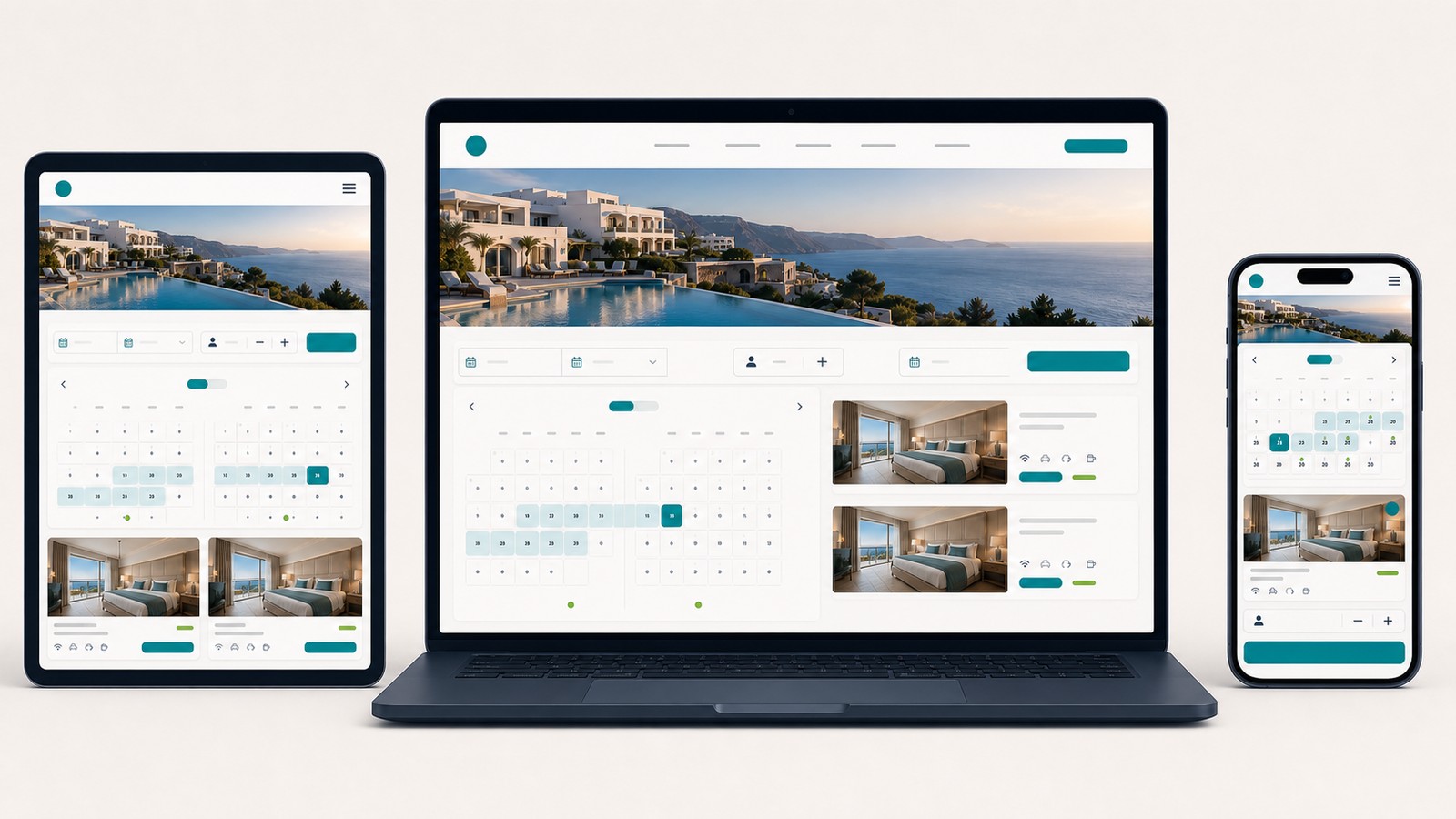
The same task on a phone. Do not invent a separate "mobile" scenario. Repeat the same journey on a real phone. This reveals whether the menu remains understandable, important information stays available, controls are easy to select, and the on-screen keyboard interferes with completing the form. The guide to responsive and adaptive design helps you decide whether the layout needs rearranging or the task needs a different interaction.
For the test, use someone who is unfamiliar with the website and give that person one task without additional instructions. Record what actually happens: where the person stops, what they reread, which link they choose, and what they expect to see next. "The participant did not find the service" is an observation. "The menu is bad" is a hypothesis about the cause, and it should be confirmed before the design changes.
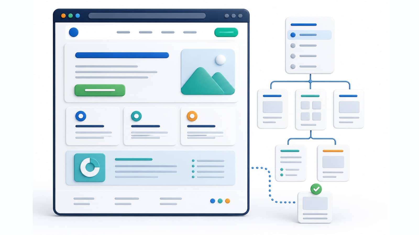
When people open a page, they should quickly understand what is being offered, who it is for, and how to continue. Information hierarchy is the order in which the page provides those answers. Visual hierarchy uses headings, size, spacing, color, and grouping to show what matters most. Navigation connects pages and provides a route to the next step.
Consider a service page that begins with a long company history while the explanation of the service itself appears much farther down. The information may be accurate, but the order does not answer the visitor's first question. If the primary button looks like every other link or every section demands equal attention, the visual hierarchy also fails to show what matters.
On every important page, check whether:
This review focuses on how people use a specific page and move to the next one. Planning the full set of sections, page types, and relationships among them is a separate task covered in the guide to a logical website structure.
A form should let visitors provide the necessary information without guessing. UX determines which details are genuinely needed and what should be explained before submission. UI presents the fields, labels, errors, and confirmation. When either part is missing, visitors may abandon the form or send an incomplete inquiry.
Review the form in three situations: with no information entered, with an error, and with correctly completed fields. In each situation, people should understand what is expected and what happened.
The W3C forms tutorial explains the role of labels, instructions, input validation, and user notifications. The GOV.UK Design System validation pattern demonstrates a practical approach to errors: explain the problem clearly, direct the person to the right place, and do not make them start over.
Visitors do not know the company's internal processes. They judge the business by what they can see. When pages use consistent names, contact details are easy to find, actions have predictable results, and important claims are supported with specific information, the website feels more trustworthy. Contradictions and unclear actions create doubt even when the service itself is good.
Look for these signs of clarity and consistency:
Consistency does not mean every page must look identical. It means that similar elements behave predictably. Visitors can focus on their decision instead of having to relearn how the website works on every page.
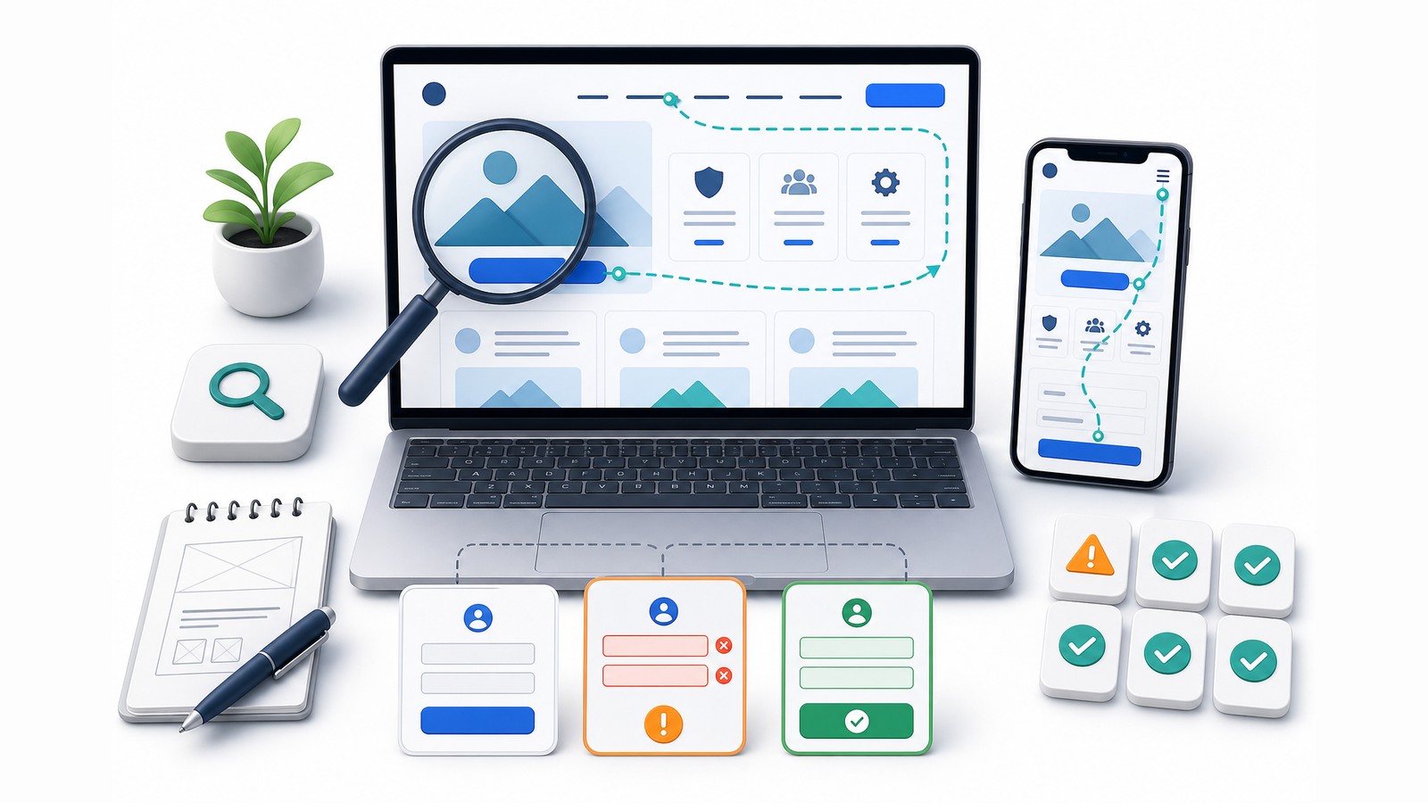
You do not need to be a designer to conduct this review. Choose one important action, such as finding the right service and submitting an inquiry, and complete the entire journey as a first-time visitor. Follow only what the website shows you. Do not rely on internal knowledge about where a page is located or how something is supposed to work. If possible, ask someone who does not know the website to repeat the same task.
Open the homepage or the main service page and scan it without reading every paragraph closely. Then explain in your own words what the company offers, who the service is for, and what problem it solves. If you can only repeat broad phrases from the page without explaining the offer, it is not presented clearly enough.
Start on the homepage with a specific question, such as: "I have an outdated company website, and I want to understand my options." Do not use the website search and do not rely on a URL you already know. Menu labels and links should lead you to the right page. If you open several unrelated pages or repeatedly go back, the journey needs to be redesigned.
On every important page, look for the next action. It might be reviewing a service, contacting the company, or submitting an inquiry. The link or button text should tell you what will happen after you select it. If several calls to action look equally important and you cannot tell which one supports your goal, the page is not guiding you clearly enough.
Review the field labels and confirm that each one makes the expected information clear. Try to continue with an empty required field or incorrectly formatted information. The website should identify exactly where the problem is and how to correct it without deleting other valid information. To test a successful submission, use a staging copy or notify the person who receives inquiries in advance. Do not send random test messages that may be processed as genuine customer inquiries.
Use the menus, links, buttons, and other important controls along the selected journey. You should be able to tell when something is loading, when an action has been accepted, and when a problem has occurred. A form submission should produce a clear confirmation, not simply an empty form or an easy-to-miss change. If you select the button a second time because you do not know what is happening, the website is not providing clear enough feedback.
Repeat the same task on a real phone. Check whether the menu opens easily, the text is readable without zooming, controls can be selected without hitting a neighboring element, and the keyboard does not cover the field or submit button. Important information and actions should not disappear just because the screen is narrower.
Check whether it is easy to understand who is behind the website, how to contact the company, and what will happen next. Important claims about experience, the working process, or results should be supported with specific information. Compare contact details, company information, terms, and service descriptions across pages. Contradictions create doubt even when they were introduced accidentally.
Record exactly what happened, where it happened, and how it interfered with the task. "The participant opened three unrelated pages before finding the service" is a useful observation. "The menu is bad" is an opinion that does not explain the cause. Correct the problems that block the task first, then those that create hesitation, and finally the minor inconveniences.
When a specialist conducts this kind of review using established principles, it is often called a heuristic evaluation. It helps identify likely difficulties. When people from the target audience complete tasks while the team observes, the process is called user testing. It shows what actually happens, but the results must be interpreted in relation to the participants and tasks selected.
When a visitor struggles, the cause is not always the organization or appearance of the interface. A slow page, a broken button, missing content, or a technical submission failure can look like poor interface design but require a different investigation. A sound evaluation does not label every problem "UX." It identifies which part of the website actually needs attention.
| What the visitor sees | Another possible cause | What to check |
|---|---|---|
| The page responds slowly or elements shift | A performance problem | Data for Core Web Vitals and the real perception of page speed |
| A button looks correct but does not work | A code, link, or server error | A technical test and the recorded error |
| The visitor does not understand the service | An unclear offer or insufficient content | The message, examples, terms, and intended audience |
| The website is difficult to use with a keyboard or assistive technology | An accessibility problem | A specialized review against WCAG 2.2 |
| Content or an important function is missing on a phone | Poor adaptation to different screens | The website's behavior at different screen sizes, its content, and its technical implementation |
UX and accessibility overlap, but they are not the same. This article identifies basic warning signs, but it is not a full WCAG conformance audit. In the same way, noticing that a page is slow does not replace measurement and technical diagnosis.
After the review, group similar difficulties even when they appear on different pages. If visitors do not understand the same service on the homepage and its detailed service page, there is probably a broader messaging problem. If they struggle only because of one broken button, a targeted repair may be enough. Do not begin with colors and typefaces when people do not understand the offer itself.
| Observation | Start with | Desired outcome |
|---|---|---|
| People do not understand what is being offered | UX and content | A clear offer, audience, and next step |
| They cannot find the right service | UX, navigation, and structure | Understandable labels and a logical route to the page |
| The important action goes unnoticed | UI and visual hierarchy | The action is recognizable without searching |
| The form creates errors and questions | UX, UI, and technical review | Only necessary fields, clear messages, and reliable submission |
| The entire website no longer reflects how the business operates | Strategy, content, and implementation | A new structure and interface aligned with real business goals |
When the problem affects the entire structure, content, and operation of an existing website, define the scope of the website redesign and what needs to be preserved during the change. For a new project, see what business website development includes. An isolated problem with a button, form, or text may only require a focused correction.
The explanations and practical checks in this guide are based on official standards, accessibility guidance, and established evaluation methods. The sources below provide additional technical depth, but they are not required to understand the main article. They are separated into official and professional sources so their roles remain clear.
This guide retains internationally used terms because they often appear in project briefs, evaluations, and conversations with designers and developers. Each term below explains what it means in practice and what should not be concluded from the term alone.
UX stands for user experience. It covers the complete experience of using a website: what people expect, what they understand, which steps they take, and whether they achieve their goal. UX is not limited to the layout of a single page, and it is not simply a claim that a website is "easy."
UI stands for user interface. It includes the visible and interactive parts people use: text, menus, links, buttons, fields, icons, and messages. UI is not only about colors and decoration because it also determines how clearly each action is communicated.
Typography is the way text is styled and arranged. It includes typeface selection, size, weight, line spacing, and the distinction between headings and body text. Good typography supports reading and shows what is important without changing the meaning of the content.
Contrast is the visible difference between two elements, such as text and its background or a primary and secondary button. Sufficient contrast helps people read content and recognize actions. Color should not be the only way to communicate an error, selection, or required field.
An interactive control is an element people use to take an action or enter information. Examples include buttons, links, fields, checkboxes, and drop-down lists. A control should communicate what can be done and what happened after the action.
A user journey is the sequence of steps someone follows to achieve a goal, such as moving from an initial search to submitting an inquiry. It is more than a list of visited URLs because it also includes the questions, decisions, and uncertainties between steps.
Usability describes the extent to which specific people can use a product or website successfully, with reasonable effort and satisfaction, in a specific situation. Usability is part of the broader user experience and is evaluated through tasks, not only through opinions about appearance.
Feedback is the visible or audible response after an action: a confirmation, warning, error message, or indication that a request is being processed. Without feedback, people do not know whether the website accepted their action and often repeat it.
An interface state is one condition of an interface element. The same element may be ready for action, selected, temporarily unavailable, processing, successful, or in an error state. Every important state should be distinguishable so visitors do not have to guess what is happening.
Information hierarchy establishes the order and importance of content. Visual hierarchy communicates that order on the screen through size, position, spacing, color, and grouping. When they do not align, essential information may look secondary while a minor element attracts too much attention.
Navigation is the system people use to move between pages and sections. It includes the main menu, contextual links, footer links, breadcrumbs, and other wayfinding elements. Good navigation uses understandable labels and helps visitors recognize where they are.
A field label is the permanently visible name that explains which information should be entered. "Contact phone number," for example, is a label. A hint inside an empty field is not a reliable substitute because it disappears when typing begins and people may forget what was expected.
Validation checks whether entered information meets the necessary conditions. It may detect a missing required field, an invalid format, or an incompatible value. Good validation does more than announce an error. It identifies where the problem is and explains how to correct it.
A heuristic evaluation is an expert review that compares an interface with established usability principles and the website's specific tasks. The method identifies likely problems, but it does not replace observing real users or prove how often each issue occurs.
User testing asks representatives of the target audience to complete specific tasks while the team observes where they struggle and how they interpret the interface. The purpose is not to ask whether participants like the design. It is to see whether they can use it successfully.
Accessibility is the ability of people with different abilities to perceive content, navigate, and take action on a website, including with a keyboard or assistive technology. Accessibility overlaps with UX and UI but also includes technical requirements that cannot be evaluated visually alone.
WCAG stands for Web Content Accessibility Guidelines. It is a W3C standard with testable accessibility criteria. WCAG is not a general impression that a website "looks accessible." It is a framework for evaluating content, design, and technical implementation.
Responsive design adapts a layout to the available space and different screen sizes. It does not mean simply shrinking the page. Content, navigation, images, forms, and actions must remain readable and usable.
According to Google's official documentation, Core Web Vitals are metrics for important parts of the experience of loading and using a page. They measure how quickly the main content appears, how responsive the page is to interaction, and whether elements shift unexpectedly. These metrics support technical diagnosis, but they do not determine whether the content and journey are clear.
ISO 9241 is a series of international standards for interaction between people and interactive systems. Different parts address concepts such as usability and human-centered design. Citing the standard does not establish compliance by itself. The relevant requirements and evaluation method must be applied to the actual product.
W3C stands for World Wide Web Consortium. It develops open web standards and publishes accessibility guidance and educational material through the Web Accessibility Initiative. W3C is not a search engine and does not evaluate the commercial quality of a website, but its standards provide a core technical foundation for web development.
Assistive technologies are devices and software that help people with disabilities use digital content. Examples include screen readers, magnification software, voice control, and specialized keyboards. A website must provide meaningful structure and clear controls so these technologies can communicate the content and available actions.