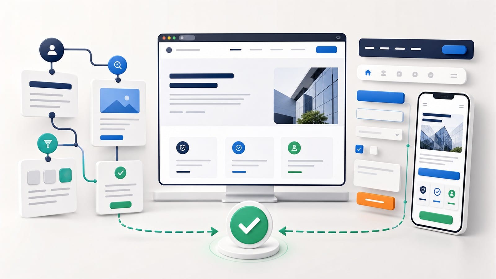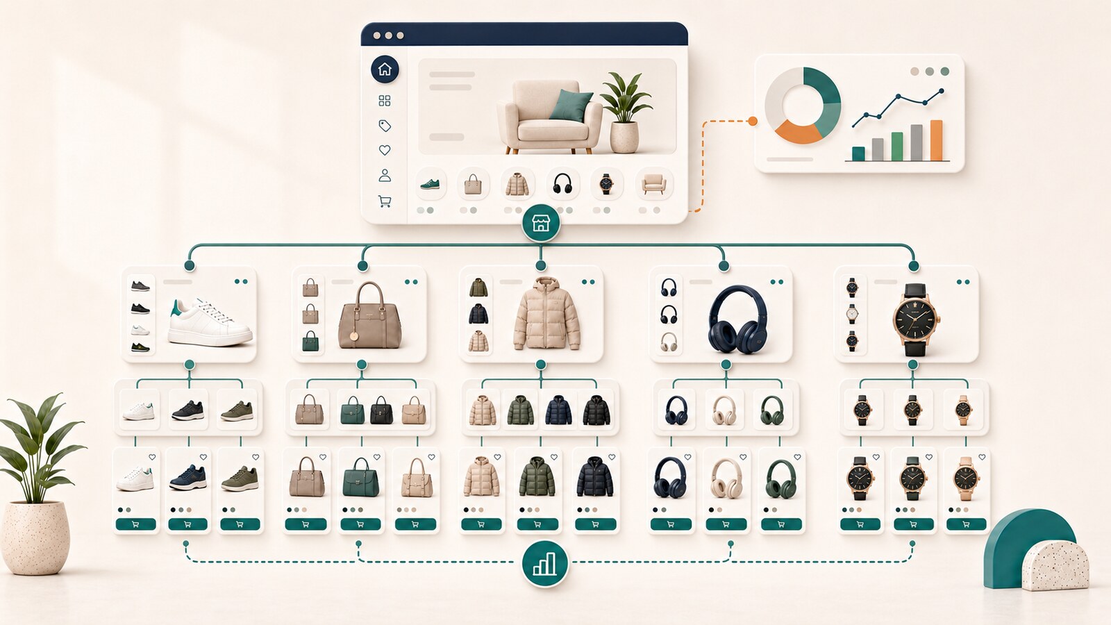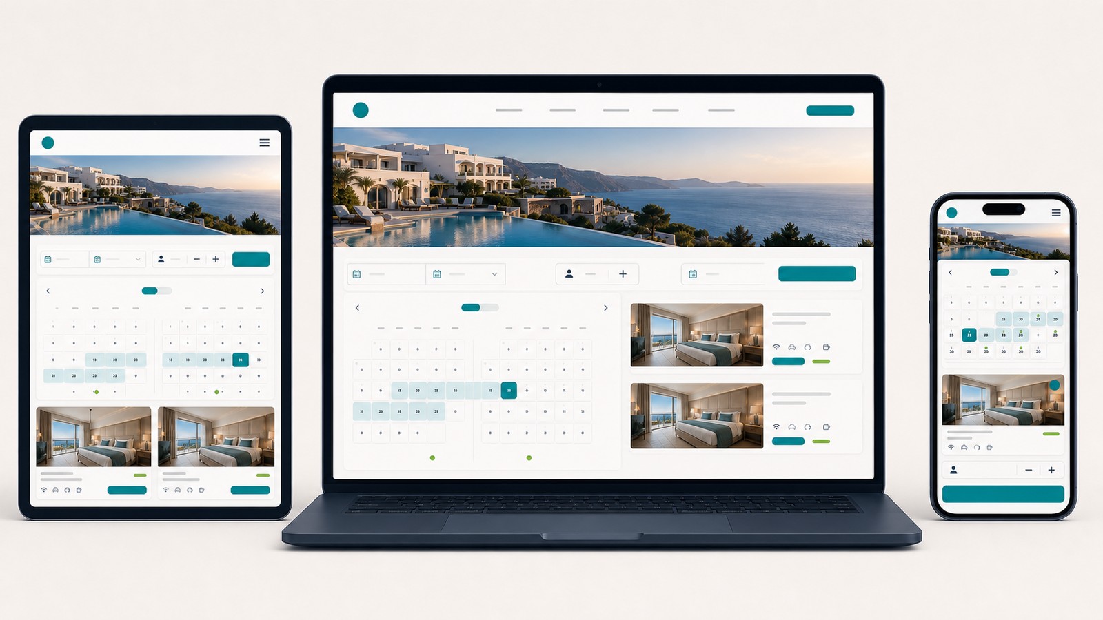
Responsive web design makes the same page comfortable to read and use on a phone, tablet, laptop, and large desktop display. An adaptive approach goes further only where a particular task needs to work differently. For most business websites, a responsive foundation is the sensible starting point. A special version is useful only when it solves a real problem that rearranging the page cannot solve.
This guide explains the practical difference between responsive, adaptive, and hybrid approaches. It is written for business owners, marketing managers, and project leads who need to compare website proposals without turning the decision into a technical exercise.
The topic belongs within the broader planning of professional web design. Project scope, timing, cost, and implementation choices are addressed when planning website design and development.
A responsive website presents the same core content on every screen, but arranges it so people can read it and take action comfortably. On a large display, two sections may sit side by side. On a phone, they may appear one below the other. Buttons remain easy to select, text stays readable, and forms fit within the available width.
The common abbreviation is RWD. MDN describes responsive web design as an approach that allows pages to adapt to different screen sizes and resolutions. It is not a final feature that can be switched on after a desktop page has been completed. Layout, content, images, navigation, and actions need to be planned together from the beginning.
Consider a service page. On a wide screen, a short overview and an inquiry form may sit next to each other. On a phone, the form can move below the explanation. The offer and the action remain the same, but the visitor receives them in an order that works in a narrower space. Use the UX and UI review for business websites to assess whether that order helps visitors complete their task.
For that reason, the promise that a website "will be responsive" is not enough by itself. A working proposal should show what happens to the menu, long headings, tables, forms, images, and important buttons as the available space changes. Visitors should not have to zoom in, drag the page sideways, or search for a button that disappeared on a smaller screen.
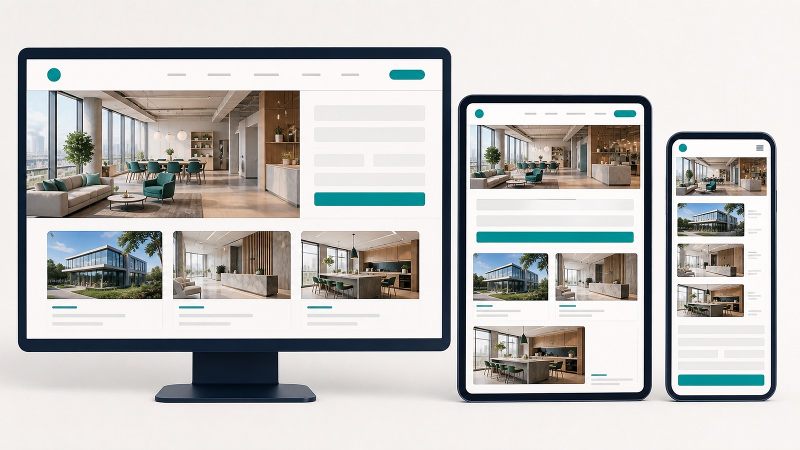
A page should change its arrangement when the available space can no longer present the content clearly. Two columns may become one. A full navigation bar may become a compact menu. Images can scale down, while important buttons remain visible and usable. These changes should follow the needs of the content, not a list of particular phone models.
Imagine a service page with three benefit cards on one row. As the space narrows, the cards may move to two rows and eventually appear one per row on a phone. This is an example of a fluid layout. Elements adjust gradually instead of being locked to a single fixed width.
Gradual resizing is not always enough. A heading may become cramped, a navigation row may no longer fit, or two buttons may become too narrow to use. At that point, the layout needs a defined change. The point at which the change occurs is called a breakpoint. MDN's guidance on media queries recommends choosing breakpoints according to the content rather than targeting specific devices.
The change is usually applied through a technical rule called a media query. A client does not need to know how that rule is written. The useful questions are why the layout changes at that point and whether the page remains clear immediately before and after the change.
You may also encounter the term mobile-first. It means that the team begins by planning a clear experience for the most limited screen space, then uses the additional room available on larger screens. The responsive design basics from web.dev illustrate the same practical idea: start with the narrowest useful presentation and expand the layout when the content has room.
Mobile-first planning does not mean that desktop visitors matter less. It forces the team to identify the essential content and action before adding more columns, decorative space, or secondary information.
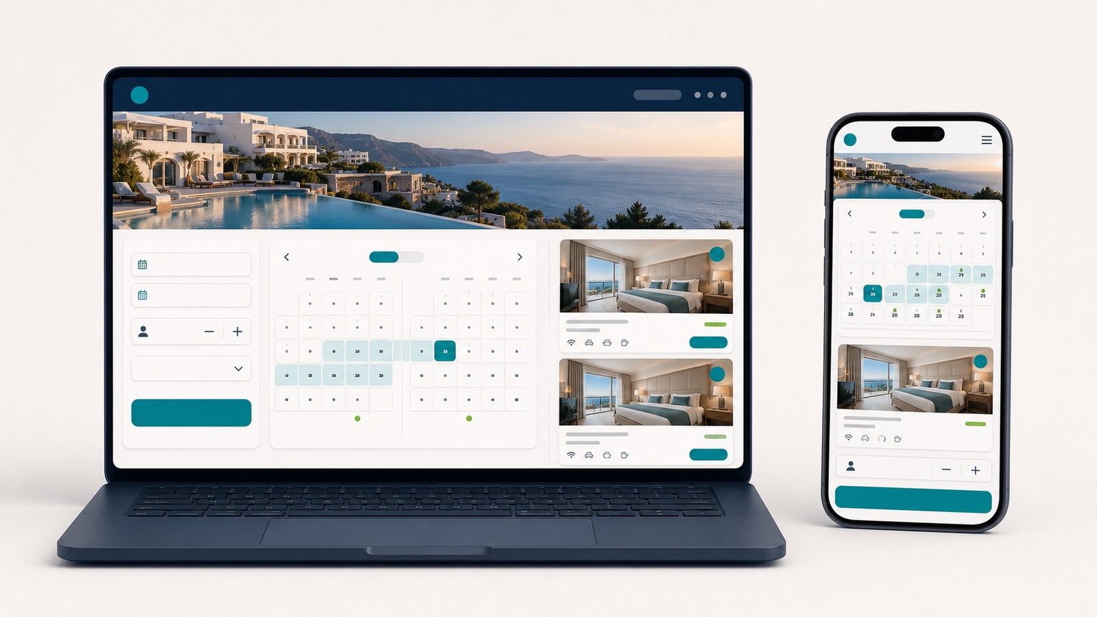
An adaptive approach is useful when an important task cannot simply shrink or move to a new position. The task needs to work in a meaningfully different way. The distinction is not a smaller heading or an image appearing below the text. The interaction itself changes so that a person can complete it more easily in a particular context.
A complex reservation form is a good example. On a large screen, several related fields may be visible together. On a phone, the same process might be divided into a few clear steps so the user is not faced with too much information at once. The purpose and required information remain consistent, but the way a person moves through the task changes.
The term adaptive web design is not used identically by every agency or developer. Do not accept the label as a complete explanation. Ask which part of the website will behave differently, what observed problem the change will solve, and how the additional version will be maintained after future content or feature updates.
Adaptive does not automatically mean a separate mobile website, a different URL, or different core content. It also does not guarantee faster loading. A special version is justified only when it makes a specific task easier and when the benefit is worth the additional design, development, testing, and maintenance.
In many projects, a hybrid approach is the more proportionate choice. Most of the website remains responsive, while only a complex form, calculator, comparison tool, or other important feature receives specialized behavior. One exceptional task should not make the entire website unnecessarily complicated.
For most business websites, responsive design is the right foundation. An adaptive solution becomes reasonable when one specific task genuinely needs a different interaction. A hybrid approach makes sense when almost the entire website can remain responsive but one important component needs specialized treatment.
Choose a responsive approach when visitors need the same information and perform the same actions regardless of the device. This is the usual case for company websites, service pages, editorial content, and catalogs with a clear structure.
For example, a visitor needs to understand a service, review evidence, and send an inquiry. On a phone, those sections may change order or move from multiple columns into a single column, but the task remains the same. There is no practical reason to build a second version of the entire page.
A responsive approach also reduces unnecessary duplication. The team maintains one source of content, one set of links, and one main user path. That does not remove the need for testing, but it makes changes easier to control.
Choose an adaptive approach for the component that cannot remain comfortable through ordinary rearrangement. It might be a detailed reservation process, a calculator with many choices, or a comparison tool that is difficult to operate in a narrow space.
The decision should begin with a specific problem. "We want a different mobile version" is not a useful requirement. "People cannot complete this form on a phone because they see too many fields at once" identifies an obstacle that can be observed, tested, and addressed.
The proposed change should then be demonstrated as a working interaction. A static image of a phone screen may show appearance, but it does not prove that the sequence is understandable, fields are easy to complete, errors are explained, or the final action is reliable.
A hybrid approach is appropriate when the general page works well responsively but one component has a justified need for different behavior. Content and most functions remain in one maintainable system, while the additional work stays limited to the exceptional case.
The simplest decision rule is to begin with a responsive foundation. Add adaptive behavior only when you can name the problem it solves and show why rearranging the existing component is not enough. If specialized behavior is necessary in only one place, there is no reason to multiply that complexity across the rest of the website.

The selected approach affects more than the website's appearance at launch. It determines how easily the site can be updated and checked later. With one responsive page, the core content is maintained in one place. With separate adaptive behavior, every meaningful change also needs to be reviewed in that version so old text, missing links, inconsistent choices, or broken form steps do not remain unnoticed.
Important content and actions should not disappear on a smaller screen. Google's mobile-first indexing guidance recommends keeping primary content, headings, images, and links equivalent across mobile and desktop presentations. Their placement can change, but visitors should receive the same meaning and retain access to the same important next steps.
The same principle applies to internal links. If a desktop visitor can reach an important service or a related explanation, that path should remain available on a phone. A link may move to a different part of the layout, but hiding it merely to make the mobile page look shorter can remove useful context and create an inconsistent experience.
Every substantial content change can affect a responsive layout. A longer heading may push a button down. A replacement image may make a section much taller. A new form field may no longer fit next to another field. A translated phrase may take more space than the original. Real pages need to be checked with their real content, not only with empty templates or idealized mockups.
Testing should cover more than three carefully selected screenshots. The layout also needs to work at the widths between common phone, tablet, and desktop examples. That is where crowded headings, clipped controls, awkward tables, and buttons split across lines often appear.
Responsive design does not guarantee fast loading or visual stability. Oversized images, heavy effects, unnecessary scripts, and poorly loaded fonts can slow down any layout. Those issues need their own diagnosis and priorities within Core Web Vitals and page speed, rather than being treated as proof that responsive design itself has failed.
Begin with what the visitor needs to accomplish, not with terminology in a proposal. If people look for the same information and follow the same path on a phone and a computer, a well-planned responsive layout is usually sufficient. If one task becomes difficult, solve that task instead of creating a second version of the whole website.
On a typical company website, visitors need to understand what the business offers, review relevant services, find reasons to trust the provider, and make contact. Those goals do not change with screen size. Only the presentation and sequence may need to change.
An adaptive variation may be reasonable when using a phone changes the interaction itself. A detailed calculator, for example, may become clearer when a large set of choices is divided into short steps. The team should demonstrate that solution in a working example and test it with people who represent the intended users.
Use the following questions to keep the decision grounded:
Future maintenance matters. Each additional version creates another place that may need to be updated and tested. The best option is usually the simplest solution that keeps the content complete, the actions accessible, and the important tasks comfortable across screen sizes.

Do not stop at the promise that the website will be responsive. Ask to see the same real page on a phone, tablet, laptop, and large display. Check whether the complete content is still available, the menu is understandable, buttons are easy to select, and forms can be completed without zooming or horizontal scrolling.
Ask what will change between screen sizes. If an element is hidden or removed, the provider should explain why the visitor no longer needs it. If adaptive behavior is proposed, ask for the exact problem it addresses and why a responsive rearrangement would not solve that problem.
Review intermediate widths, not only three prepared examples. A page can look correct in selected mockups and still break as the window gradually narrows. Long headings, comparison tables, navigation labels, grouped fields, and pairs of buttons deserve particular attention.
Clarify how images will be handled. A visual that is useful on a large display may lose its meaning when reduced. The answer may involve a different crop or a simpler composition, but the image should still support the same message rather than introduce different core content.
Finally, ask who checks the website after future changes. New copy, a replacement image, another field, or an additional section can disrupt an arrangement that previously worked. A reliable partner should be able to explain the review process in plain language and show what acceptance looks like without replacing the answer with a list of technologies.
Responsive web design, or RWD, means that one page adapts to different screen sizes. The core content and actions remain available, while sections can change width, position, or order.
For example, a page may show text and a form side by side on a large screen, then place the form below the text on a phone. Responsive design does not merely mean that a website opens on a phone, and it does not guarantee speed, quality, or search visibility by itself. Unlike an adaptive approach, the main page adjusts fluidly without a separately designed way to complete the task.
An adaptive approach gives a particular part of the website a deliberately different way of working for a defined situation. The change is more substantial than moving sections or reducing their width.
For example, a form may show related fields together on a large screen but divide them into clear steps on a phone. Adaptive does not necessarily mean a separate mobile website or URL. The difference from a responsive approach is that the interaction changes, not only the arrangement.
A hybrid approach combines a responsive foundation with a limited number of adaptive solutions. Most pages follow the same responsive system, while only the component with a demonstrated need behaves differently.
For example, a company website can remain responsive while one complex calculator receives a specialized phone interaction. Hybrid does not mean mixing solutions without a plan. Each exception should have a clear reason and a defined maintenance process.
A fluid layout uses the available space instead of being locked to one screen width. Elements can gradually shrink, expand, wrap, or move to a new row.
For example, three service cards may become two per row and then one per row. Fluid does not mean that every element stretches without limits. A fluid layout adjusts gradually, while a breakpoint introduces a defined change when the current arrangement no longer works.
A breakpoint is the point at which a page changes its arrangement because the previous layout is no longer clear or usable. The reason might be crowded text, navigation that no longer fits, or two sections becoming too narrow.
A breakpoint should not be selected only because it matches a particular device model. It should follow the needs of the content. Breakpoints can be used in responsive and adaptive solutions, so their presence alone does not identify the overall approach.
A media query is the technical rule that tells a page when to apply a different layout or style. It can, for example, move a form below the main text when the available width is no longer sufficient.
The media query is the mechanism, while the breakpoint is the point at which the change takes effect. The important result for a client is the behavior of the page, not the syntax used to produce it.
Mobile-first means planning for the most limited screen space first. The team identifies and arranges the essential content and action before using the extra space available on larger screens.
It does not mean that large displays are unimportant. It is also different from Google's use of mobile content for indexing. Mobile-first describes an order of design and development decisions, not a separate version of the website.